Wednesday, 9 May 2012

A Third Element

As an extension to the handwriting posters produced, this third element takes the idea of posting and sharing thoughts and puts it online. To describe how this might happen, I mocked up several screens such as the ones here:

I then took these images into a series of spreads which describes the concept. 


Thursday, 3 May 2012

A post on post-it posters

Just an update on how the poster designs for "Make your Mark" are going...


The first poster is an overall campaign design - promoting the idea of sharing through handwritten text, but also incorporating the idea of the post-it:


The faded-out blocks will be real post-its, and the only printed elements will be the the logo, strapline, and the social media links. The post-its may (or may not!) have things written on them, as if people are already sharing - equally I may investigate simply leaving a pen by the side of the poster, to thoroughly make the most of the interactive element. I am aware that the poster as a whole needs a touch more info, but this is where I'm at to date.

The second poster is more finalised... But not quite ready to print. It promotes the idea of writing on the post-it, and sharing it with others:


It's meant to look like a zoomed in image of a wall full of post-its, with the info and images contained in the confines of a post-it shape. In the white square will be a block of post-its - so that people can grab one and start writing. Again, the info on this may need tweaking, so that people get the idea.


Wednesday, 25 April 2012

Phillustration takes a bow

This is my last Illustration module (everyone: "awwww"). I'm switching over to focus purely on Graphics - in terms of my degree work anyway. The experience I've gained from doing Illustration modules over the last two years has been great, and I'm happy, because it gives some of my graphics work an illustrative edge.

I've blogged enough about these spreads... Here are the very final ones. I'm happier with some than others, but overall I think I've made a decent fist of it. 


And just to test your browser to the max - here's yet more images, this time of the dummy book itself. Each spread was printed as a single sheet, so the back of page 2 was glued (spray mounted) to the back of page 3... And so forth.


It took me a while, but I began to really enjoy this project - especially when I began to have final images begin to take shape. I will continue to embrace all that drawing has to offer, but I feel I can no longer command the nickname of Phillustration. Shame, eh? 

Friday, 13 April 2012

Post-it posting (2)

I've been busy with post-it notes, and it's driving me around the bend...


Here are some of the more creative things I've been doing with them. Massive thanks to my housemate who unwittingly left her door open whilst she went away for the weekend. Hopefully she won't read this until she gets back...:


Brightens the place up, don't you think?

She loves milk... So we "drew" milk.


Here I used the title and strapline for my initiative... You'll see why.

It took a while, but the results are quite striking... Hopefully she'll keep some of it up. I particularly like the busyness and vibrance of the multi-coloured wall, and thought I'd use it - stemming from an idea I'd already been working with.


In order to create more of a uniformity, the image was flattened, and the colours reduced. I think this helps the image appears more vivid, but am aware that it loses some of its reality... The post-its are meant to look as if they are growing out from the centre - to show more and more people adding their thoughts. If you don't know what I'm on about then check back here.

I'm also aware that a landscape canvas may not work in my favour, and may experiment with having the canvas as a square... Still much to do, at least I've got plenty of sticky notes to annotate my work on! Feel free to help me annotate by use of the comments box below...

Some Snarks are Boojums...

A while back, I wouldn't have thought I would get to the stage where I'd want to post any of this work - this just goes to show what hard work and determination (or late nights and cups of coffee) can do for you.

To see the story and my explanations, check the label "narrative"... It's unlikely that I'll be doing much else under that title very soon... Having said that...

I'm actually quite pleased with how I rescued this - it's not brilliant (yet, I still have a week and a half and plenty more coffee) but I think I've managed to own it and give it an interesting continuity. Do tell me if I'm wrong, I'd love honest feedback.

There are 13 doubles in total for the book - here are my favourite 6. The others all still need a bit of work - but the hope is that even if they don't seem as slick as I hope these are, they will look more accomplished when packaged together with these.

For your perusal...:


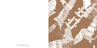
The brief was to include two doubles which were worked up in full colour. I had too much fun ripping up paper in one of many rage fits which has accompanied this module, and so produced three. As you can see, the ripped paper is a theme - I used t to describe the scene of the island the characters are one.

Stupidly, it's taken me this long to begin really loving this project. Yes, it's been tough, and wouldn't normally be my kind of thing, but I've begun to really get my teeth into it... Good job with the deadline looming... Anyway, I guess that's a good thing?

I'll post all the spreads, the cover, photos of the dummy book etc. when it's all done!


Thursday, 29 March 2012

Multimedia post-it posting

Again, just a few words on the latest pieces produced for my media work... First the microsite homescreen:


It's gone a few stages further since I last posted - the "camera" will move around the desk when the appropriate buttons are pressed, and the image has been cleaned up, with the text etc. being finalised and laid down as if a part of the environment itself.


I've been working on a viral to with this whole post-it obsession of mine too - it's not ready to show, but here's a sneak preview. It's a stop-motion animation telling a couple's story through post-it note drawings. The aim is that it persuades people to share their own story through the post-it/handwriting campaign I'm working on:


Post-it posting

Just a couple of poster designs as I plough on with this work.

The first is an image taken from a range of environments I took photos of - aimed at showing how our handwriting can sit anywhere, and offer something more to that environment.


The second borrows De Stijl ideals and colours from the 90s (reminiscent of a Rubik's Cube?). I feel it's fairly successful - the yellow post-it could well be the interactive element I've wanted, and could be stuck on after printing. My only issue is seeing how impactful it is at this size.