After that marathon, a quickie.
I recently went on a Christian kids' camp for 11-14s, on which the theme was "Superheroes", and beforehand was asked to cobble together some signs for rooms. The names of said rooms were already decided upon (the gym became the "Action Arena", the chill-out room became "The Bat Cave" - you get the idea). A lot of the designs I produced weren't exactly stuff I'd put in a portfolio, but they were fun, and I thought I'd share one or two with you here.
Each dorm had a different superhero as their name:
I used images stolen from Google, and sub-standard design software to put them together, but the idea comes through anyway. The toilets were also themed:
But my favourite design was this one:
In case you haven't figured it out - this was the name of the swimming pool for the week. Those of you who know me will know that I won't use image if text suffices, and here was a chance to do just that.
Hello! Graphic design, illustration, and creative thoughts from a student designer. Feel free to browse and contact me via links on the right.
Sunday, 14 August 2011
Getting back on the bike
That's exactly what I did recently actually. Having not ridden for almost two years I jumped on yesterday and rode the best part of twenty miles.
This post isn't really anything to do with cycling, but starting riding again yesterday was a useful (if tenuous) parallel to me beginning to create things again. After a few weeks of not really creating any visuals, and not producing any blog-worthy work, I'm getting back on the bike and writing proposals for projects to be begun come September. I've no work to show from that yet, but it brought to my attention that I haven't posted anything on here for a while, and that I'd better get back in practice by mentioning some of the things I have been doing over summer.
I guess this is me getting back on the blogcycle...
My first port of call was a simple task for the University's Christian Union - a new logo. It was a project which me and my friend Becky were keen to get started on - a logo design for a group you're a part of is quite a nice challenge to take on.
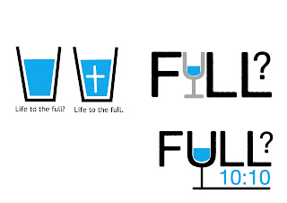
These are in no way complete designs - I was merely using the pages of a PDF document as a sketchbook. The idea was to show that life can only be "full" with Jesus - but we wanted to avoid the cheesy, over-the-top Christian design solution (you know what I mean) and go for something a bit simpler, with an interactive feel. I won't talk any more on the matter - once we have the hoodies themselves I shall post some images of them themselves.
That's quite enough for one post, I've said far too much and communicated very little. Ahh, it's good to be back.
This post isn't really anything to do with cycling, but starting riding again yesterday was a useful (if tenuous) parallel to me beginning to create things again. After a few weeks of not really creating any visuals, and not producing any blog-worthy work, I'm getting back on the bike and writing proposals for projects to be begun come September. I've no work to show from that yet, but it brought to my attention that I haven't posted anything on here for a while, and that I'd better get back in practice by mentioning some of the things I have been doing over summer.
I guess this is me getting back on the blogcycle...
My first port of call was a simple task for the University's Christian Union - a new logo. It was a project which me and my friend Becky were keen to get started on - a logo design for a group you're a part of is quite a nice challenge to take on.
For most of you, this will be a fairly boring visual, but I'm a bit dull and pathetic, so this kind of thing excites me. We wanted something which looked fairly corporate, but also had an element of fun. We achieved the latter by messing with the characteristic of the type - removing the dots on the "i"s and shortening the ascender on the "t". We struggled with the clumsiness of having such a long title, but this was solved by using different weights of a nifty little font we discovered called Avenir. The green was chosen not as an absolute solution, instead we decided that this colour could be changed depending on the situation it was used in.
Linked to the design of this was a project to design a motif to be displayed on the front of hoodies worn by CU members - partly as an unifying identity sort of thing, but mostly in order to convey the particular message we had chosen as our motto text: "I have come so that they may have life, and have it to the full". Below are some of the ideas generated for the design of the hoodie: (these were mostly thrown out, but may well be recycled at a later date)
That's quite enough for one post, I've said far too much and communicated very little. Ahh, it's good to be back.
Subscribe to:
Comments (Atom)


