Showing posts with label logo. Show all posts

Monday, 29 April 2013

Foodbank campaign booklet


A booklet produced to outline a hypothetical campaign strategy for Wolverhampton Foodbank. The cover is above, and some examples of spreads are below:


The physical booklet is 180mm square, and each page appears as a single page, so turning pages with circles on reveal a different graphic in the same space overleaf. The booklet consists of 19 pages.


Saturday, 6 April 2013

Re-Threading

I reckon it's always important to be aware of ways in which you can enhance a particular visual brand, and update the look and feel of a logotype. So, when we decided we wanted a range of new logos for sections on the Thread, I used it as an opportunity to refresh the whole look of the "brand".

The current "main" logo used.
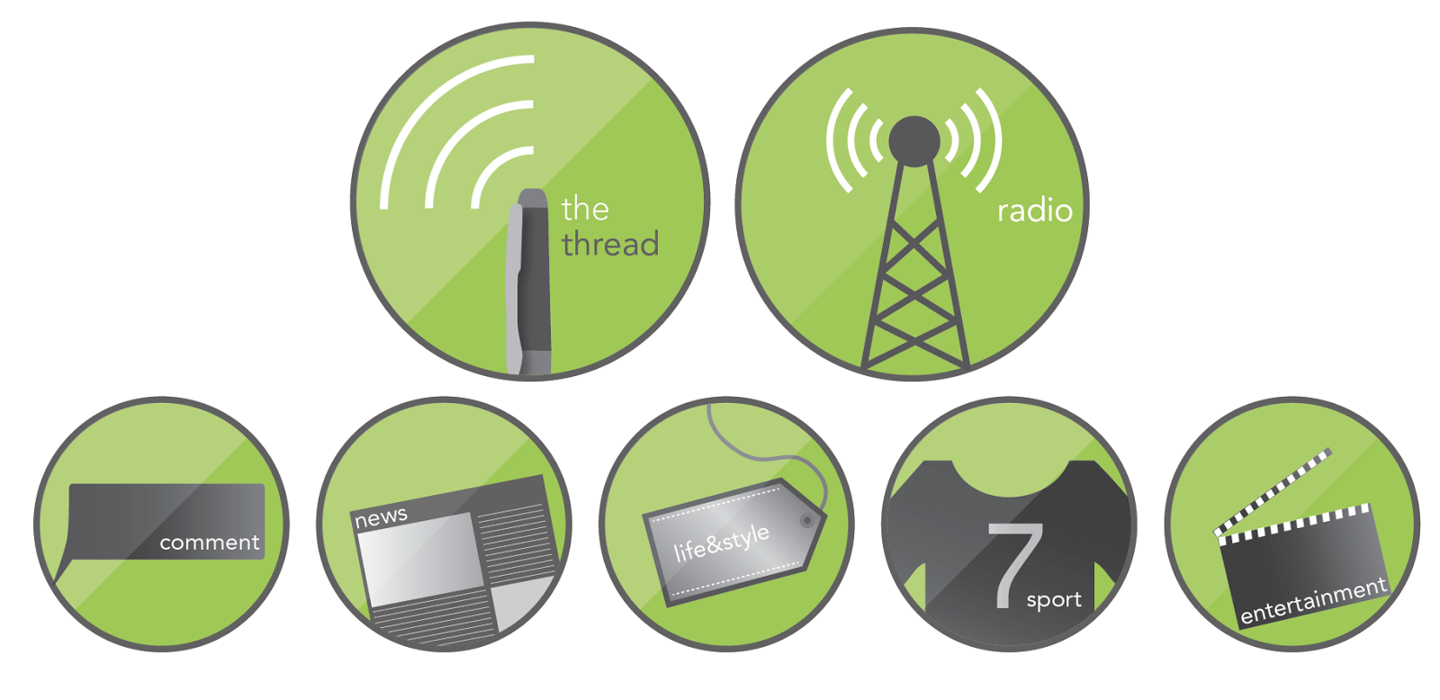
We wanted iconic images to go with each section on the site (they're not actually in use yet, so this is somewhat of a sneak preview... yeah, I know that excites you...), and also to represent the newspaper and radio sections.

This gave the opportunity to slightly change the way we use the logo. The problem we've had with the logo above is its shape - it doesn't lend itself neatly to, say, a Facebook profile picture. This is rectified by adding a second logo.

The new set of logos - with a more rounded look so as to be more flexible, and fit into gaps the above logo can't!

Hopefully, both will be used alongside each other, just to achieve different things. As I say, these aren't in use yet, but will hopefully enhance what is already a fairly strong brand around campus, and make each section more accessible.

Thursday, 21 March 2013

Growing a logo

As a part of a year-long project, I've been working on a semi-live brief which involves the promotion of a local charity - namely, the Wolverhampton Foodbank. I've mostly been working on a campaign strategy (which you'll see at a later date), but for now I thought I'd share the new logo I've been working on. First, the old logo:


This logo is a logo used by many foodbanks, and adapted. I felt there were many opportunities missed in the design of the identity here. I wanted to make sure there was a link between the old style, and the new, and so this old logo was a fairly strong influence on my "re-brand"


My interpretation is above. I took some of the same themes to do with nature and growth, but created something rather different. The two sides "food" and "bank" are connected in a smooth and organic way, and the addition of the leaf to this creates an apple graphic. The rest of the text is flowing, and represents the growth/vines present in the old identity.

Thursday, 14 March 2013

Sounds like summer?

A wee little brief I managed to squeeze into my busy schedule. An enjoyable one, too. The slide below tells all about it, so I won't waste words by waffling on!


Saturday, 16 February 2013

Threading some more

As well as working for the Student' Union during my time at Uni, I've also done some volunteer design work for the SU newspaper and radio team, The Thread. I posted my logo design-y stuff a long while back, but for one reason or another haven't shared anything else! Here a some bits and bobs that I've created for the team to use. The first is a Facebook cover, and the other two were designs for 60x40in posters.


I've also done bits and bobs for the website, but most of the praise for how that's looking is down to my good friend Ash, who also volunteers and maintains the site. It's at www.the-thread.co.uk if you fancy a gander.

Wednesday, 23 January 2013

Branding danger

A self-directed project which allowed me to try my hand at rebranding the Hazardous Materials department at West Midlands Fire Service, this brief took me to and from the drawing board more times than I care to mention... So I'll keep this brief.

The first problem comes with the issue of "branding danger". What these guys do is serious stuff, but is also about teaching and training firemen and women to avoid and diffuse dangerous situations.

The angular shapes come from the Hazardous Materials classic diamond shapes for identifying hazards, and the colours are (of course) representative of fire, with a cheeky flame shape thrown in for good measure.

Overall, the chosen logo is adaptable in a variety of colours and outlines, and an example of how it can be applied is shown below in some experimentation with business cards.


Saturday, 15 September 2012

Threading

I haven't posted anything on here in far too long... My bad! It isn't that I haven't had things to blog though, and hopefully I'll be able to post some of the stuff I've been getting my hands dirty with this summer, over the next few weeks.

Thought I'd take a bit of time to show this though.

The brief was to create a logo for the new student newspaper - a student-run publication which will consist of an on-screen new outlet, and a radio station to boot. The logo was to incorporate these ideas, and was to look sharp and dynamic. A pretty open ended brief really.

I quickly settled on using the colours of green and grey, to fit with the pre-existing colour palette of the Students' Union brand. I started with three designs:


The first takes the newspaper, and has the name resting upon it - with sharpened ascenders on the "h" and the "d" to add a sharpness, what with the newspaper being a digital publication.

The second uses an arrow to show this - this hints at the idea of the radio. The "thread" of the green stroke is key here too.

The team though, were most keen on the ideas involved with the third logo, such that this was the one which was brought forward to completion, as below...


The newspaper background was lost, due to the publication being digital, and the needle was changed to a pen. I think the logo works due to the clear link between the pen of the "t" and the radio mic of the "d" - helped with the slanted pen stroke in green. I kept the depth by the stroke being tapered, and the slant on the text itself. Overall, a successful project.

Tuesday, 20 March 2012

Owning the words you write

I haven't posted much about this project so far, so here's a sort of summary post.


The brief is the same across two modules - promoting handwriting as an alternative to tryping/texting. In this particular module we were to design and produce two A2 posters doing just that. My brand palette uses the campaign title "make your mark", and encourages people to own their words, by handwriting them in their own style.


The initiative I was promoting was one which works to get people to write their own thoughts/stories etc onto post-it notes and then to post them up at "posting stations" (all fictional of course). This was my initiative across both modules.


Here's the folder work I've worked on for the last couple of weeks:


You'll notice the presence of the fountain pen in my designs - this project is being followed by pen manufacturer Sheaffer, who kindly gave us fancy writing tools to aid the project. Students love free stuff!

As you can see, the layouts all include similar colours, themes, and fonts (Bodoni... If anyone cares). The poster designs are quite simple thus far - relying on an iconic post-it to carry the information. Such is, it was hard to transfer them to screen - they lose something of their iconic nature:


(Bearing in mind that these are mock-ups) the top design works reasonably, but the bottom is far from ideal - back to the drawing board on that one for sure.

One idea I think is working well is the omission of the work "your" from the post-its - the impetus will be on the viewer to fill in the gap in their own hand. More experimentation could be tried with the post it itself being tangible too. I'll post more when I've done more!

Sunday, 30 October 2011

Out of Logos Cometh Animation

I promised (what an anti-climax) to post my finished logo animation, so here it is.


The logo was a simple concept (see here), so the animation was made simple too. The three-tone sequence was chosen to mirror the three coloured strokes, along with the three words in the strapline. I'm no sound technician though, so don't judge on the quality of the sounds themselves - they more give an indication as to the kind of jingle which would accompany the movement.

Thursday, 20 October 2011

Out of Darkness Cometh Logos

The organisation at Uni never fails to amaze me. Upon enrolling on the "Applied New Media" module I was reassured that there would be no clashes in me taking this module along side the others, despite me being the only student in that module not taking a year-long Graphics module alongside it. I was keen to do the module, as it dealt with things I hadn't ever looked at, and hadn't really been given the chance to until now.

Our first brief? To animate a logo. Brilliant, I thought - what kind of logo were they looking for us to animate? Only the logo the rest of the group would be creating in the year-long module I was not a part of.

Not to worry though (and apologies for those who I've confused with my description of our confusing Uni module-ing system), as I was able to knock up a logo with some time to spare. The logo was to be a corporate design for the city of Wolverhampton.


Treating Wolverhampton as a product to be marketed was not an easy task - as anyone who has visited may be willing to testify. But, for what Wolves lacks in immediately engaging beauty, it makes up for with the quality of the people. Wolves is a diverse place, full of a variety of ethnicities, religions, and classes, and what's struck me more and more as I live within the city is the striking way in which this does not seem to cause division. All told, there's a fairly unified spirit within the area - which has helped the city to grow.

Anyway, sociology aside, that's where my design started, and it was realised via the use of strokes which not only overlap, but strive in a similar direction. Different colours were used to signify the diversity in the city.

I'm not expecting any phone-calls from the council with monetary offers, but I reckon this logo will be good enough to showcase the small amount of Flash knowledge I've picked up over the last few weeks. 

Sunday, 14 August 2011

Getting back on the bike

That's exactly what I did recently actually. Having not ridden for almost two years I jumped on yesterday and rode the best part of twenty miles.


This post isn't really anything to do with cycling, but starting riding again yesterday was a useful (if tenuous) parallel to me beginning to create things again. After a few weeks of not really creating any visuals, and not producing any blog-worthy work, I'm getting back on the bike and writing proposals for projects to be begun come September. I've no work to show from that yet, but it brought to my attention that I haven't posted anything on here for a while, and that I'd better get back in practice by mentioning some of the things I have been doing over summer. 


I guess this is me getting back on the blogcycle...


My first port of call was a simple task for the University's Christian Union - a new logo. It was a project which me and my friend Becky were keen to get started on - a logo design for a group you're a part of is quite a nice challenge to take on.


For most of you, this will be a fairly boring visual, but I'm a bit dull and pathetic, so this kind of thing excites me. We wanted something which looked fairly corporate, but also had an element of fun. We achieved the latter by messing with the characteristic of the type - removing the dots on the "i"s and shortening the ascender on the "t". We struggled with the clumsiness of having such a long title, but this was solved by using different weights of a nifty little font we discovered called Avenir. The green was chosen not as an absolute solution, instead we decided that this colour could be changed depending on the situation it was used in.

Linked to the design of this was a project to design a motif to be displayed on the front of hoodies worn by CU members - partly as an unifying identity sort of thing, but mostly in order to convey the particular message we had chosen as our motto text: "I have come so that they may have life, and have it to the full". Below are some of the ideas generated for the design of the hoodie: (these were mostly thrown out, but may well be recycled at a later date)


These are in no way complete designs - I was merely using the pages of a PDF document as a sketchbook. The idea was to show that life can only be "full" with Jesus - but we wanted to avoid the cheesy, over-the-top Christian design solution (you know what I mean) and go for something a bit simpler, with an interactive feel. I won't talk any more on the matter - once we have the hoodies themselves I shall post some images of them themselves.


That's quite enough for one post, I've said far too much and communicated very little. Ahh, it's good to be back.