Showing posts with label layout. Show all posts

Monday, 29 April 2013

Foodbank campaign booklet


A booklet produced to outline a hypothetical campaign strategy for Wolverhampton Foodbank. The cover is above, and some examples of spreads are below:


The physical booklet is 180mm square, and each page appears as a single page, so turning pages with circles on reveal a different graphic in the same space overleaf. The booklet consists of 19 pages.


Saturday, 13 April 2013

Foodbank posters

I posted a couple of weeks ago about a campaign I was putting together for Wolverhampton Foodbank. Well, I say for them - they know I'm doing it, as to whether it will really be used... It's unlikely! Regardless, the concept is still sound.

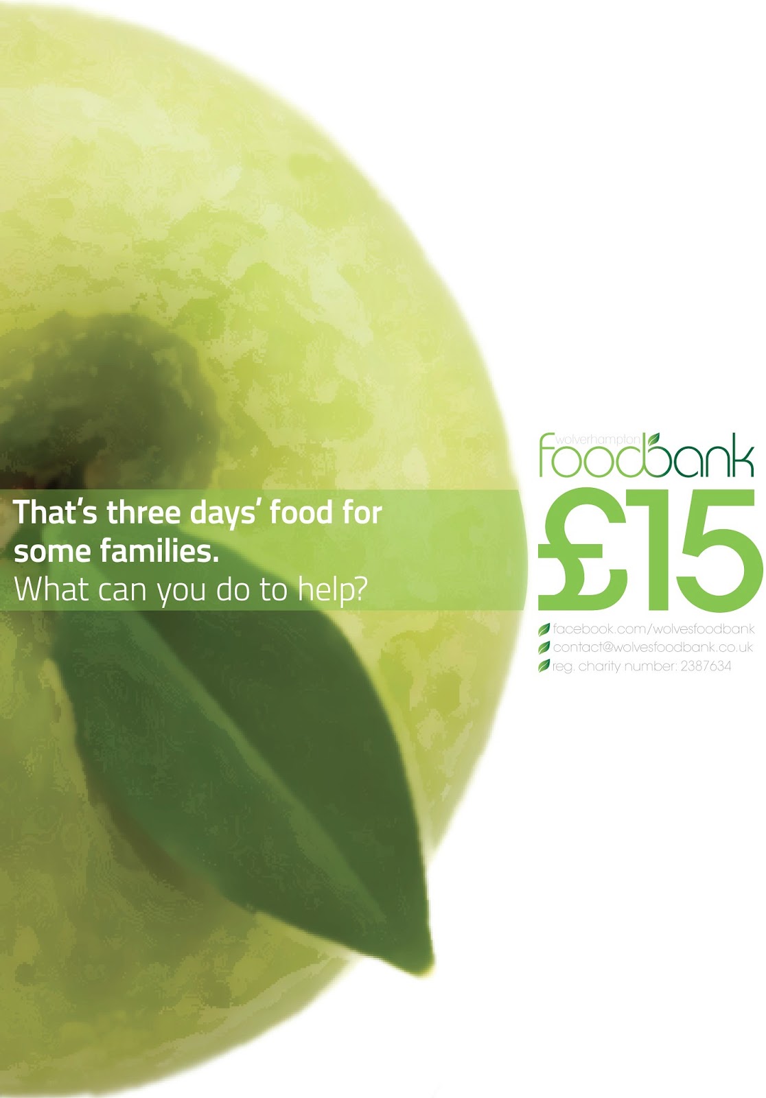
I don't want to bore you with the countless pages of ideas I've produced (these will be used later though!), so here's the main outcome: two posters used to highlight the main message of the promotion. 


The campaign hinges on two points. Firstly, it was important to make people aware of how much food they waste, and therefore, how much money they are throwing away. Second, it was highlighted how much that wastage amounts to in terms of the foodbank. The viewer is invited to make the link between the two.

The posters were designed to fit with each other to create a circular graphic, which is a reflection of the branding in general, and reflects the circular value of the new logo.

Saturday, 16 February 2013

Threading some more

As well as working for the Student' Union during my time at Uni, I've also done some volunteer design work for the SU newspaper and radio team, The Thread. I posted my logo design-y stuff a long while back, but for one reason or another haven't shared anything else! Here a some bits and bobs that I've created for the team to use. The first is a Facebook cover, and the other two were designs for 60x40in posters.


I've also done bits and bobs for the website, but most of the praise for how that's looking is down to my good friend Ash, who also volunteers and maintains the site. It's at www.the-thread.co.uk if you fancy a gander.

Saturday, 29 September 2012

SU Round-Up (September)

I started a new job this month! I'm now working for the marketing department in my Students' Union, producing some of their graphics-y things. Here's some of the stuff I've been getting up to these last few weeks - not massively exciting to most people, but I'm a bit of a geek when it comes to big chunks of type...

A6 flyer promoting Autumn Election

These two images taken from a booklet entitled "Society Support Handbook".


 These three from a booklet promoting student representation.


Wednesday, 9 May 2012

A Third Element

As an extension to the handwriting posters produced, this third element takes the idea of posting and sharing thoughts and puts it online. To describe how this might happen, I mocked up several screens such as the ones here:

I then took these images into a series of spreads which describes the concept. 


Thursday, 3 May 2012

A post on post-it posters

Just an update on how the poster designs for "Make your Mark" are going...


The first poster is an overall campaign design - promoting the idea of sharing through handwritten text, but also incorporating the idea of the post-it:


The faded-out blocks will be real post-its, and the only printed elements will be the the logo, strapline, and the social media links. The post-its may (or may not!) have things written on them, as if people are already sharing - equally I may investigate simply leaving a pen by the side of the poster, to thoroughly make the most of the interactive element. I am aware that the poster as a whole needs a touch more info, but this is where I'm at to date.

The second poster is more finalised... But not quite ready to print. It promotes the idea of writing on the post-it, and sharing it with others:


It's meant to look like a zoomed in image of a wall full of post-its, with the info and images contained in the confines of a post-it shape. In the white square will be a block of post-its - so that people can grab one and start writing. Again, the info on this may need tweaking, so that people get the idea.


Wednesday, 25 April 2012

Phillustration takes a bow

This is my last Illustration module (everyone: "awwww"). I'm switching over to focus purely on Graphics - in terms of my degree work anyway. The experience I've gained from doing Illustration modules over the last two years has been great, and I'm happy, because it gives some of my graphics work an illustrative edge.

I've blogged enough about these spreads... Here are the very final ones. I'm happier with some than others, but overall I think I've made a decent fist of it. 


And just to test your browser to the max - here's yet more images, this time of the dummy book itself. Each spread was printed as a single sheet, so the back of page 2 was glued (spray mounted) to the back of page 3... And so forth.


It took me a while, but I began to really enjoy this project - especially when I began to have final images begin to take shape. I will continue to embrace all that drawing has to offer, but I feel I can no longer command the nickname of Phillustration. Shame, eh? 

Friday, 13 April 2012

Post-it posting (2)

I've been busy with post-it notes, and it's driving me around the bend...


Here are some of the more creative things I've been doing with them. Massive thanks to my housemate who unwittingly left her door open whilst she went away for the weekend. Hopefully she won't read this until she gets back...:


Brightens the place up, don't you think?

She loves milk... So we "drew" milk.


Here I used the title and strapline for my initiative... You'll see why.

It took a while, but the results are quite striking... Hopefully she'll keep some of it up. I particularly like the busyness and vibrance of the multi-coloured wall, and thought I'd use it - stemming from an idea I'd already been working with.


In order to create more of a uniformity, the image was flattened, and the colours reduced. I think this helps the image appears more vivid, but am aware that it loses some of its reality... The post-its are meant to look as if they are growing out from the centre - to show more and more people adding their thoughts. If you don't know what I'm on about then check back here.

I'm also aware that a landscape canvas may not work in my favour, and may experiment with having the canvas as a square... Still much to do, at least I've got plenty of sticky notes to annotate my work on! Feel free to help me annotate by use of the comments box below...