Showing posts with label promotional. Show all posts

Monday, 29 April 2013

Foodbank campaign booklet


A booklet produced to outline a hypothetical campaign strategy for Wolverhampton Foodbank. The cover is above, and some examples of spreads are below:


The physical booklet is 180mm square, and each page appears as a single page, so turning pages with circles on reveal a different graphic in the same space overleaf. The booklet consists of 19 pages.


Thursday, 25 April 2013

Shatter Effect

Firstly, apologies. I realise I haven't AT ALL blogged about this brief, despite it being quite a big part of my last six months. Essentially though, these images should explain the brief and my work in full. These are the spreads I put forward for presenting "new and innovative ways of promoting a pre-existent brand". The brand, in this case, was a local band called Shatter Effect. This project was much more about marketing and promotion than it was about design.


It helps to like the client you're designing for - and in this case I don't even have to lie about that! You can check out the band on my recommendation below. They're also at www.facebook.com/ShatterEffectMusic and www.twitter.com/ShatterEffect.


Saturday, 13 April 2013

Foodbank posters

I posted a couple of weeks ago about a campaign I was putting together for Wolverhampton Foodbank. Well, I say for them - they know I'm doing it, as to whether it will really be used... It's unlikely! Regardless, the concept is still sound.

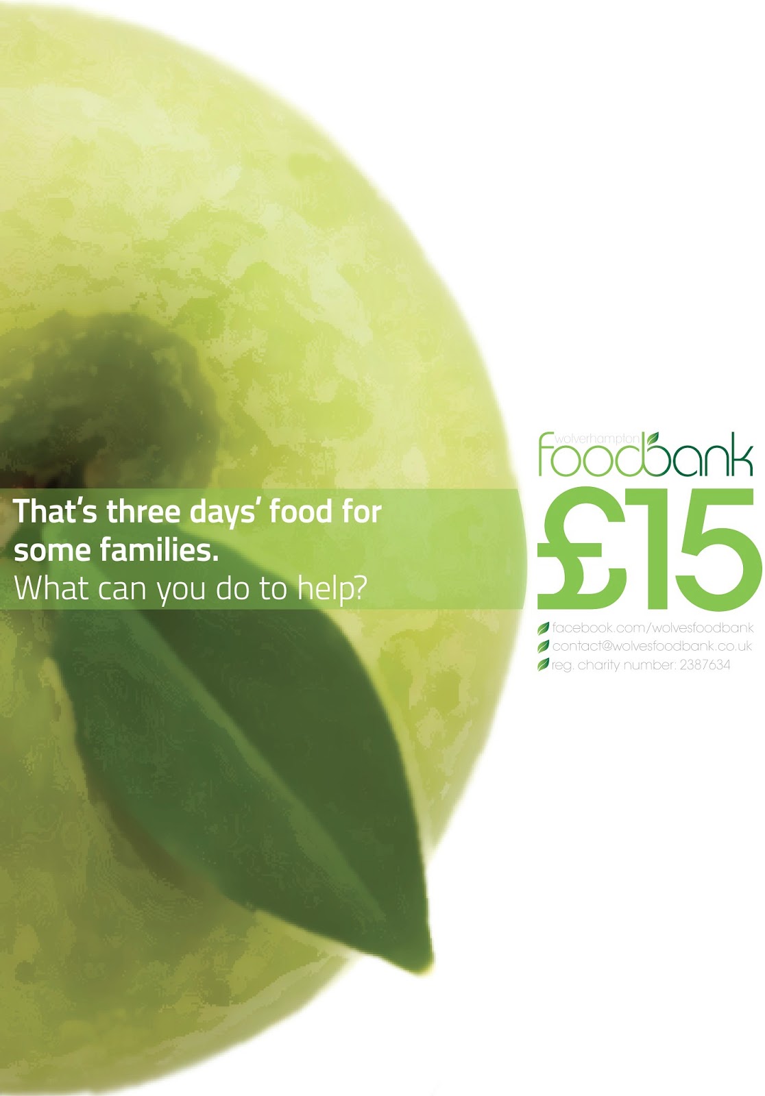
I don't want to bore you with the countless pages of ideas I've produced (these will be used later though!), so here's the main outcome: two posters used to highlight the main message of the promotion. 


The campaign hinges on two points. Firstly, it was important to make people aware of how much food they waste, and therefore, how much money they are throwing away. Second, it was highlighted how much that wastage amounts to in terms of the foodbank. The viewer is invited to make the link between the two.

The posters were designed to fit with each other to create a circular graphic, which is a reflection of the branding in general, and reflects the circular value of the new logo.

Thursday, 21 March 2013

Growing a logo

As a part of a year-long project, I've been working on a semi-live brief which involves the promotion of a local charity - namely, the Wolverhampton Foodbank. I've mostly been working on a campaign strategy (which you'll see at a later date), but for now I thought I'd share the new logo I've been working on. First, the old logo:


This logo is a logo used by many foodbanks, and adapted. I felt there were many opportunities missed in the design of the identity here. I wanted to make sure there was a link between the old style, and the new, and so this old logo was a fairly strong influence on my "re-brand"


My interpretation is above. I took some of the same themes to do with nature and growth, but created something rather different. The two sides "food" and "bank" are connected in a smooth and organic way, and the addition of the leaf to this creates an apple graphic. The rest of the text is flowing, and represents the growth/vines present in the old identity.

Saturday, 16 February 2013

Threading some more

As well as working for the Student' Union during my time at Uni, I've also done some volunteer design work for the SU newspaper and radio team, The Thread. I posted my logo design-y stuff a long while back, but for one reason or another haven't shared anything else! Here a some bits and bobs that I've created for the team to use. The first is a Facebook cover, and the other two were designs for 60x40in posters.


I've also done bits and bobs for the website, but most of the praise for how that's looking is down to my good friend Ash, who also volunteers and maintains the site. It's at www.the-thread.co.uk if you fancy a gander.

Friday, 14 December 2012

Répondez s'il vous planes (2)

I blogged below this about the "RSVP" exhibition, so it seemed right that I share the things I've been creating! All follow a design palette created specifically for my exhibit.

Both these posters will appear at the exhibition. My responsive piece involves people writing things down on provided paper, folding them, and throwing them into my installation, which will involve a bin and some fishing-wire-suspended-planes. 


3-point instructions on what the exhibit expects of the audience

Instructions on how to fold your plane! step by step on the left, fold lines on the right.


Blog "banner" to advertise the event as a whole

An A6 flyer to be distributed to promote the event - details are on this side...

...and on the back, following the fold lines will result in the invite becoming a 3D plane!


The exhibition opens in March - anyone in Wolves who fancies coming? The private view is on the 7th March, and the exhibition opens on the 8th. Drop me a line if so, or keep your eye on www.visualcommunicationwolverhampton.blogspot.com!

Monday, 26 November 2012

SU Round-Up (November)

A couple of the things I've found myself doing this month at the Students' Union!


Felt this should be posted too, as I was not only involved in the design, but the event itself! 


Friday, 17 February 2012

Ticking over

With my current modules it's been quite frustrating - we're not currently at a stage where I'm producing any final pieces for publication, or anything worthwhile blogging really. So it helps to have a side project so as to gain some form of satisfaction in seeing some final pieces come together.


These are by no means masterpieces (far too much live tracing's gone on for that to be true), but they are quick, attention-grabbing promotional pieces for events our Christian Union are putting on next week. At time of writing venues and speakers haven't even been finalised... But that's an issue for a different blogpost.


(A recycled poster design - not sure if I've posted this one before or not.)


Don't ask why some are different shapes to others - they've been through the wringer in terms of file format transfer...

If I had time to talk about these, I would, but instead I'm going to try and carry on organising them!

Friday, 4 March 2011

Keeping busy

Recently I have been fortunate enough to have had real projects to be getting on with, in the form of publicity for a couple of events.


Firstly, I was asked by my mum and dad to design a flyer inviting friends and family for a joint celebration of their 50th birthdays, a party which took place last weekend. "Aha!", I thought, rubbing my hands at the prospect of caricaturing them... I wasn't too mean, it's not really my bag.


These are the two designs I sent them, and they plumped for the top one. The party was a strange idea (Dad was 50 last summer, Mum this), so it was important to communicate this in a way which was simple, yet interesting, something I believe was achieved quite well through the "nearly" and "and a bit" comments. The tag-line "Celebrating a Century of Life" helps add to this interest in a light-hearted way. The whole look had a digital look to it, with the characters almost avatar-like in appearance, so a digital, squared face seemed apt for the wording.

The second was a simple job, and one I didn't really have to do much work on - I'll post it anyway...


My flatmate's girlfriend graduated from Wolves last year from doing Fine Art, and is involved with this show, going on in London at the start of June. She provided me with the text, and the layout for the text - I was required to provide a backdrop, choose a typeface, and to draw attention to both the "Platform C" and "Emergent art show 2011" being a separate, more important ideas.

I went for an arty style by including a wash of pastels - this allows the text to be read clearly, but also allows for depth in tone. I suppose whilst I'm posting I should probably plug the thing - the website's www.platformc2011.com (ignore the poster address, we had to get that changed) if you want to know anything about that.

I suppose I should crack on with some work I'm going to be graded on... Hmmm.