Showing posts with label wit. Show all posts

Saturday, 13 April 2013

Foodbank posters

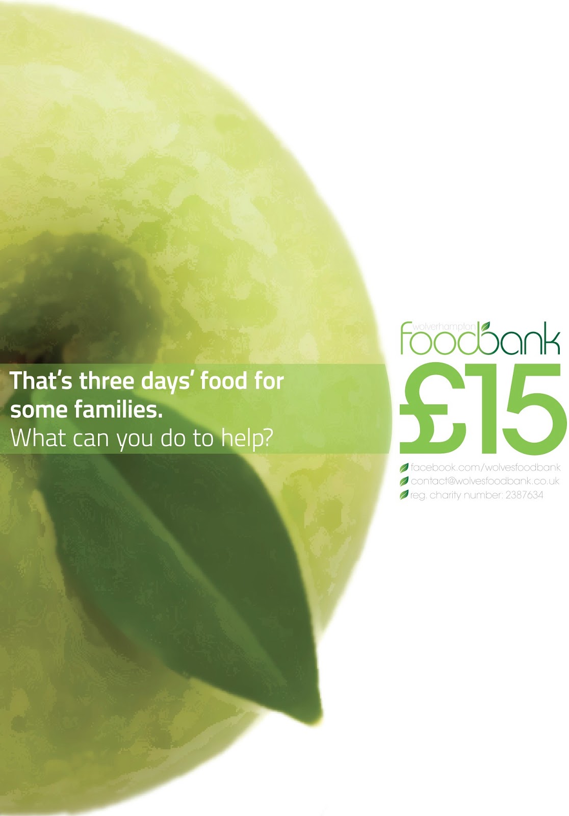
I posted a couple of weeks ago about a campaign I was putting together for Wolverhampton Foodbank. Well, I say for them - they know I'm doing it, as to whether it will really be used... It's unlikely! Regardless, the concept is still sound.

I don't want to bore you with the countless pages of ideas I've produced (these will be used later though!), so here's the main outcome: two posters used to highlight the main message of the promotion. 


The campaign hinges on two points. Firstly, it was important to make people aware of how much food they waste, and therefore, how much money they are throwing away. Second, it was highlighted how much that wastage amounts to in terms of the foodbank. The viewer is invited to make the link between the two.

The posters were designed to fit with each other to create a circular graphic, which is a reflection of the branding in general, and reflects the circular value of the new logo.

Thursday, 14 March 2013

Sounds like summer?

A wee little brief I managed to squeeze into my busy schedule. An enjoyable one, too. The slide below tells all about it, so I won't waste words by waffling on!


Friday, 13 April 2012

Post-it posting (2)

I've been busy with post-it notes, and it's driving me around the bend...


Here are some of the more creative things I've been doing with them. Massive thanks to my housemate who unwittingly left her door open whilst she went away for the weekend. Hopefully she won't read this until she gets back...:


Brightens the place up, don't you think?

She loves milk... So we "drew" milk.


Here I used the title and strapline for my initiative... You'll see why.

It took a while, but the results are quite striking... Hopefully she'll keep some of it up. I particularly like the busyness and vibrance of the multi-coloured wall, and thought I'd use it - stemming from an idea I'd already been working with.


In order to create more of a uniformity, the image was flattened, and the colours reduced. I think this helps the image appears more vivid, but am aware that it loses some of its reality... The post-its are meant to look as if they are growing out from the centre - to show more and more people adding their thoughts. If you don't know what I'm on about then check back here.

I'm also aware that a landscape canvas may not work in my favour, and may experiment with having the canvas as a square... Still much to do, at least I've got plenty of sticky notes to annotate my work on! Feel free to help me annotate by use of the comments box below...

Sunday, 10 April 2011

Boxes

For our last project in our "skills module" we were directed to use Illustrator in order to create a visual based on the title "Where I live". I love the idea of a title like this - it's just vague enough, and yet just specific enough to come up with some interesting ideas.

I came up with the idea that living in halls is a little like living in a box. Bear with me...

As a fairly large human being, any room would seem small to me, but the rooms in Lomas are small for most, and between my room and the poky kitchen, I have very little space which is mine. There's something very organised about halls - a corridor with several doors off of it - it feels like we've all been compartmentalised.

Wow, I feel all fine-arty again. The second box-comparison I can make is the quality of the living arrangements here. Since moving in last September we've encountered an ant infestation, mould, a lack of heating for the whole of winter, a broken oven, mould, broken doors, mould, and now the return of the ants... Not entirely unlike living in a box then.


I expressed this sentiment through the text, and exaggerated the angles in the visual. The box graphic was constructed around a live-traced photo of a hunched-up me, which I sketched over with the pencil tool. I added the shadow to give depth. It has a fairly quick, graphic feel to it.

Overall, I'm happy with the piece - given a longer period of time I may have created something more complex, but this fulfils the brief quite well. Roll on July, when I move into a bigger box.

Sunday, 9 January 2011

"Make something difficult look easy"

As part of my contextual studies module for last term, we were asked to blog about a site/artist/bunch of bits of work we found inspiring/interesting/fun. I'm not a fan of blogging solely about other people's work, but seeing as my blog contains only my own work, this post should tick a box on my assessment sheet. (A quick hello goes out to my tutor who I know will be reading this at some point, hopefully the previous sentence will be taken in good humour...)

Anyway, I can do the rest of my post without witty or snide remarks (honest) because the site I have decided to focus on is one I love - one I was introduced to a few years back and one I frequently visit to gain fresh ideas, or simply to rest from my own work, and choose to appreciate the simplicity of thinking artistically... Drum-roll, please: http://www.eatock.com/

Daniel Eatock is based in London, and from the evidence on his website he's dabbled in all sorts of areas of art. However, it's not the aesthetics I find most interesting, it's the thought processes. This isn't a biography of Eatock, so I'll show you some of his work in pictures - you can make your own mind up:


Of course, the best way to get a feel for someone's work is to have a flick through for yourself - the website is more than accessible, in fact, the general feel to Eatock's work is that of accessibility. Included on the website are a variety of interactive works, where viewers submit their own responses to his work.

All in all, I find it great resource. Eatock encourages you to think in different ways, and challenges to some extent what we appreciate as art.