Showing posts with label brand. Show all posts

Monday, 29 April 2013

Foodbank campaign booklet


A booklet produced to outline a hypothetical campaign strategy for Wolverhampton Foodbank. The cover is above, and some examples of spreads are below:


The physical booklet is 180mm square, and each page appears as a single page, so turning pages with circles on reveal a different graphic in the same space overleaf. The booklet consists of 19 pages.


Saturday, 6 April 2013

Re-Threading

I reckon it's always important to be aware of ways in which you can enhance a particular visual brand, and update the look and feel of a logotype. So, when we decided we wanted a range of new logos for sections on the Thread, I used it as an opportunity to refresh the whole look of the "brand".

The current "main" logo used.
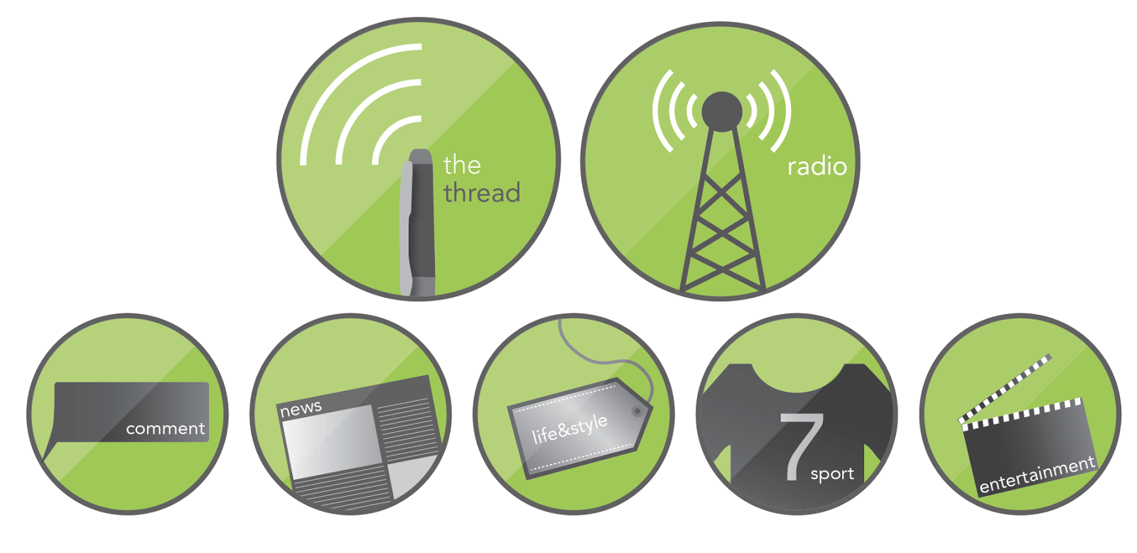
We wanted iconic images to go with each section on the site (they're not actually in use yet, so this is somewhat of a sneak preview... yeah, I know that excites you...), and also to represent the newspaper and radio sections.

This gave the opportunity to slightly change the way we use the logo. The problem we've had with the logo above is its shape - it doesn't lend itself neatly to, say, a Facebook profile picture. This is rectified by adding a second logo.

The new set of logos - with a more rounded look so as to be more flexible, and fit into gaps the above logo can't!

Hopefully, both will be used alongside each other, just to achieve different things. As I say, these aren't in use yet, but will hopefully enhance what is already a fairly strong brand around campus, and make each section more accessible.

Thursday, 21 March 2013

Growing a logo

As a part of a year-long project, I've been working on a semi-live brief which involves the promotion of a local charity - namely, the Wolverhampton Foodbank. I've mostly been working on a campaign strategy (which you'll see at a later date), but for now I thought I'd share the new logo I've been working on. First, the old logo:


This logo is a logo used by many foodbanks, and adapted. I felt there were many opportunities missed in the design of the identity here. I wanted to make sure there was a link between the old style, and the new, and so this old logo was a fairly strong influence on my "re-brand"


My interpretation is above. I took some of the same themes to do with nature and growth, but created something rather different. The two sides "food" and "bank" are connected in a smooth and organic way, and the addition of the leaf to this creates an apple graphic. The rest of the text is flowing, and represents the growth/vines present in the old identity.

Thursday, 14 March 2013

Sounds like summer?

A wee little brief I managed to squeeze into my busy schedule. An enjoyable one, too. The slide below tells all about it, so I won't waste words by waffling on!


Wednesday, 23 January 2013

Branding danger

A self-directed project which allowed me to try my hand at rebranding the Hazardous Materials department at West Midlands Fire Service, this brief took me to and from the drawing board more times than I care to mention... So I'll keep this brief.

The first problem comes with the issue of "branding danger". What these guys do is serious stuff, but is also about teaching and training firemen and women to avoid and diffuse dangerous situations.

The angular shapes come from the Hazardous Materials classic diamond shapes for identifying hazards, and the colours are (of course) representative of fire, with a cheeky flame shape thrown in for good measure.

Overall, the chosen logo is adaptable in a variety of colours and outlines, and an example of how it can be applied is shown below in some experimentation with business cards.


Friday, 28 September 2012

Bits and bobs (and mugs)

A lot of the stuff I end up designing in my spare time is for the Christian Union at University, as I am an active member. I blog about those kind of things here: www.livingandspeakinginwolves.blogspot.com - less pictures, more words over on that blog, I'm afraid...

Over summer there were a number of things needing doing. These pieces are pretty self-explanatory, so I'll just pop them here for you:


Term cards are tricky (I think I chatted on about this same idea a year ago!) as they hold a lot of boring information - and you only need to know one piece of information a week! So, I tried to make something different of it - breaking the usual "list" approach, and instead turning it into a sort of info-graphic which colourfully shows where we meet when!


The blocky brand of mugs and cake is continued through to the publication we do, and although our budget didn't even stretch to colour printing (sob), at least they can be viewed here in multi-coloured beauty.