Sunday, 18 December 2011

Can I have another minute?

Maybe it's a little self-indulgent to keep posting the same work, but when this amount of time has been spent on it, I feel slightly more justified.


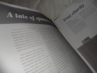
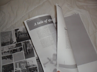
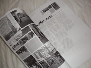
In order to get a feel for how the magazine/editorial article might look and work, I used black and white copies to construct a couple of dummy books - one for each chapter.


Chapter one was assembled with a messy sellotape approach - I cut out the pages to their actual size, taped the relevant pages back-to-back, and then taped the spine. Chapter two was done slightly differently:


Due to a lack of A2 paper I avoided this technique with the first chapter, but upon attempting it with chapter two I found it worked reasonably well on A3. The pages are left uncut - with crop marks left showing, and the book itself is essentially made up from blank A3 sheets. My pages are simply mounted upon these blank sheets.

Neither is a pretty picture on close inspection, but this wasn't the main reason for doing it - the two dummy books do their job in showing how the chapters themselves would flow - something which mounting individual pages (which is my next task) can't show.

Tuesday, 13 December 2011

Carrolling

A while ago I posted about how I'd be producing spreads for a children's book adaptation of Lewis Carroll's "The Hunting of the Snark", and that it wouldn't be long before posting some of my actual artwork for it.


Two months later...


It's been a bit stop-start this one - I think I've known how it's going to look since deciding on my story (not really advisable, but never mind), and as such have struggled to motivate myself to disappoint my imagination by actually putting it down on paper. I've finally relented, and produced these over the last few weeks/two months. I imagine this'll be something which occupies me over Christmas.


The imagery needed to be mysterious, but also fairly vibrant and quirky. Backgrounds will be in pastel, with the dreadful drawings seen here laid over the top drawn digitally.


These two show slightly better how a finished page would look - having two spreads out of thirteen dummied up is slightly behind schedule... But at least I know where it's roughly going.


I'll probably post more of this kind of thing when it actually looks good - anywhere from two months to two years then!

Monday, 12 December 2011

Can I have a minute?

When tinkering with something as specific as letterforms, kerning, widows and the like, the only satisfaction is viewing the final thing and seeing no further improvements to make.

Unfortunately, that point never comes - we only ever get to the point where we say "Yeah, it's pretty good, and that's where I'll leave it". Never satisfied.

Anyway, I'm rather sick of looking at these, so you can look at them instead.


If you've no idea what they're about then look here. Don't try and read the type, it's latin (although I may have left the word "phallus" lurking about in there somewhere...).

I wanted chapter 2 to visually link in, and achieved this with use of a signature colour, a similar bookended approach, and similar typographic features. I decided to slightly change the pace by using more imagery in chapter 2 - this keeps it from looking too stagnant (or at least that's the plan!).

Right, there's one battle fought and won - the weapons for my second battle may or may not include the following instruments: spray mount, a scalpel, and a strongly-worded email to the people who provide the toner in the Uni printers.