Sunday, 14 August 2011

Superhero signage

After that marathon, a quickie.


I recently went on a Christian kids' camp for 11-14s, on which the theme was "Superheroes", and beforehand was asked to cobble together some signs for rooms. The names of said rooms were already decided upon (the gym became the "Action Arena", the chill-out room became "The Bat Cave" - you get the idea). A lot of the designs I produced weren't exactly stuff I'd put in a portfolio, but they were fun, and I thought I'd share one or two with you here.


Each dorm had a different superhero as their name:


I used images stolen from Google, and sub-standard design software to put them together, but the idea comes through anyway. The toilets were also themed:


But my favourite design was this one:


In case you haven't figured it out - this was the name of the swimming pool for the week. Those of you who know me will know that I won't use image if text suffices, and here was a chance to do just that.

Getting back on the bike

That's exactly what I did recently actually. Having not ridden for almost two years I jumped on yesterday and rode the best part of twenty miles.


This post isn't really anything to do with cycling, but starting riding again yesterday was a useful (if tenuous) parallel to me beginning to create things again. After a few weeks of not really creating any visuals, and not producing any blog-worthy work, I'm getting back on the bike and writing proposals for projects to be begun come September. I've no work to show from that yet, but it brought to my attention that I haven't posted anything on here for a while, and that I'd better get back in practice by mentioning some of the things I have been doing over summer. 


I guess this is me getting back on the blogcycle...


My first port of call was a simple task for the University's Christian Union - a new logo. It was a project which me and my friend Becky were keen to get started on - a logo design for a group you're a part of is quite a nice challenge to take on.


For most of you, this will be a fairly boring visual, but I'm a bit dull and pathetic, so this kind of thing excites me. We wanted something which looked fairly corporate, but also had an element of fun. We achieved the latter by messing with the characteristic of the type - removing the dots on the "i"s and shortening the ascender on the "t". We struggled with the clumsiness of having such a long title, but this was solved by using different weights of a nifty little font we discovered called Avenir. The green was chosen not as an absolute solution, instead we decided that this colour could be changed depending on the situation it was used in.

Linked to the design of this was a project to design a motif to be displayed on the front of hoodies worn by CU members - partly as an unifying identity sort of thing, but mostly in order to convey the particular message we had chosen as our motto text: "I have come so that they may have life, and have it to the full". Below are some of the ideas generated for the design of the hoodie: (these were mostly thrown out, but may well be recycled at a later date)


These are in no way complete designs - I was merely using the pages of a PDF document as a sketchbook. The idea was to show that life can only be "full" with Jesus - but we wanted to avoid the cheesy, over-the-top Christian design solution (you know what I mean) and go for something a bit simpler, with an interactive feel. I won't talk any more on the matter - once we have the hoodies themselves I shall post some images of them themselves.


That's quite enough for one post, I've said far too much and communicated very little. Ahh, it's good to be back.

Tuesday, 10 May 2011

Typogratriumph

I've a lot to say about this work, so I'll cut to the chase.

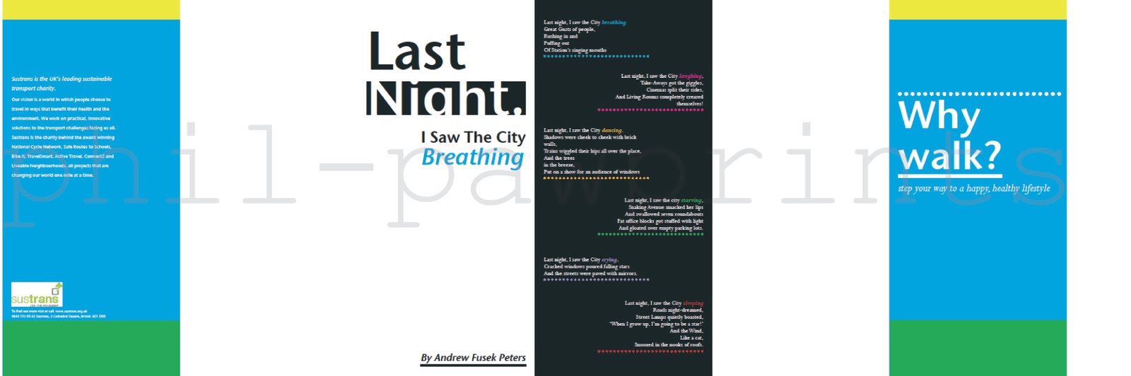
Our final typography project of the year (yeah, already) was to create a leaflet which promotes walking to families, in order to keep them healthy and fit (see here). We were provided with the body copy, and a logo for the commissioning charity, but the rest was up to us.

The leaflet was a clumsy size to work with - imagine two landscape A4's next to one another, and then folded into 6 - creating 12 "sides" which were 210 by 99. Not easy to mock up, not particularly easy to print either. What it did offer though, was a wide scope for spreading the text over the sides quite nicely - there was a chance to experiment with scale, juxtaposition and colour, and I feel I did all these things fairly well.


If you click and zoom, you should be able to read the thing. The colours haven't coped well with the transfer from INDD to PDF to JPG, but you get the gist of what I was trying to do. You'll have to use your imagination as to where the page divdes are, as I didn't export the marks. This is the "inside", because when concertinaed the front and back pages needed to be on the reverse of the printout...


...as seen here. The black and white section in the centre is a poem which was to be present on the leaflet - I wanted this to appear a separate idea to the rest of the information - to make it stand out, but also so as to add variance in the design, lest it become boring.

I feel the type hangs quite well in the leaflet, especially on the first few pages in the inside, and the overall image I feel works. The image of the walking man at the start gives a feel of walking through the leaflet, helped by the colours. I'm quite pleased with it, my only concern would be that the poem looks perhaps too much of a separate entity to the main body, but in its own right I'm happy with the poem too.

I'll admit I wasn't enjoying doing this when I began the sketches, but the piece turned into something I really enjoyed - a culmination of a few skills I've learned this year, and a fairly decent end to this particular type module.

Monday, 11 April 2011

The invasion of the paper people

My flatmates think I've gone mad, and, with a title like that, you probably do too.

As an art and design student it's quite usual for rather uncommon things to become commonplace in my room.... In the past, the odd things hanging around my room have included empty bottles of wine, numerous copies of the Radio Times, and shelf brackets. Recently, the oddity has been chains of paper people.

We were asked to design an illustration for a piece of writing which can be found here. It's well worth a read - the writer is talking about something he calls "Politeness Enforcement Tactics", referencing the way people act towards each other in society. He mentions people placing bags on seats they aren't using, people speeding up to zebra crossings, and people cutting into queues - and then goes on to describe ways in which we can fight against this (the "tactics" I just mentioned).


The dominant story is one of a queue for a bus stop, and the way in which the people in the queue work together to exclude a queue-jumper. I won't explain it all (it's worth reading!), but my ideas were to show a unity between the queue members, and to show an exclusion of the jumper. Hence why I have paper people stuck on my mirror, perched on my windowsill, and sitting on my bookcase.

I guess in part my flatmates were right - using the actual paper people was mad, as it didn't quite work visually in my initial ideas here as I'd hoped it might. So, I literally went back to the drawing board, sketched out some linked people, and created a cityscape collage.


It's a little different to your usual editorial illustration, but I like the hands-on feel of the collage. It has a diagrammatic look to it, created by using grid paper, which links in to the clinical nature of the people-chain. Probably the greatest difficulty was in transferring the visual from paper onto screen, although it did give me chance to tweak a few things that weren't quite right.

I'm not going to lie, I hated this project. I struggled to get a grip with what the article needed in terms of an illustration - and this came out in my early sketches. However, I am pleased that I was able to work through it and produce a piece which is by no means fantastic, but just about fits the bill.

I'm keeping the paper people up in my room (in case you were wondering). It'd be wrong to throw them away after I went to all the trouble of naming them...

"She kicked and screamed while I held her throat" (part 2)

Basically I've been sat on this final piece for a while now, finishing other work whilst this only needed one or two tweaks. I've finished it now though - if you've no idea what I'm on about then you'll have to look here.


I think both sides of the CD cover have a sort of vintage photo feel - they look old and faded, and yet still have the sinister feel I was after (created by a complex system of spotlights before the shot was taken). One regret I have is not to have had more variance between the front and back covers, but to do so I would have had to set the shot up again, and learn a lot more about photography!

On a positive though, the hand-drawn text fits fairly well with the theme - on the front it sits uncomfortably next to a happy image - this is similar to the reason I used the lighting the way I did, in that it suggests that not all is well in a subtle way. Overall, I feel the cover fits the music itself quite well. If you disagree let me know, and if you haven't heard the songs then I recommend them to you.

Sunday, 10 April 2011

Boxes

For our last project in our "skills module" we were directed to use Illustrator in order to create a visual based on the title "Where I live". I love the idea of a title like this - it's just vague enough, and yet just specific enough to come up with some interesting ideas.

I came up with the idea that living in halls is a little like living in a box. Bear with me...

As a fairly large human being, any room would seem small to me, but the rooms in Lomas are small for most, and between my room and the poky kitchen, I have very little space which is mine. There's something very organised about halls - a corridor with several doors off of it - it feels like we've all been compartmentalised.

Wow, I feel all fine-arty again. The second box-comparison I can make is the quality of the living arrangements here. Since moving in last September we've encountered an ant infestation, mould, a lack of heating for the whole of winter, a broken oven, mould, broken doors, mould, and now the return of the ants... Not entirely unlike living in a box then.


I expressed this sentiment through the text, and exaggerated the angles in the visual. The box graphic was constructed around a live-traced photo of a hunched-up me, which I sketched over with the pencil tool. I added the shadow to give depth. It has a fairly quick, graphic feel to it.

Overall, I'm happy with the piece - given a longer period of time I may have created something more complex, but this fulfils the brief quite well. Roll on July, when I move into a bigger box.

Saturday, 2 April 2011

Typografail

Having a blog is a bit like having a pet. They're fun to play with, you get love through them, and yet they take effort to keep looking nice - whether that be cleaning out a bowl, or taking them for a walk to keep them fit (and to stop them breaking things in the house). After a while the effort becomes a little too much, and the neglect sets in, until you rediscover the pet, forgotten and dying under the bed.

Is it obvious I've never had a pet?

I haven't posted much recently (as that ridiculous spiel was supposed to tell you), and this is either because I've produced so much work I just haven't had time to blog it, or it's because I haven't produced any work worth blogging about. I'll let you decide on that one.

Things are slow at the moment - briefs are tiring, inspiration is hard to come by, and deadlines are looming (which invariably has a negative effect on the creative side of my brain). Ah well, there's always the sweet haven of typography, my newly found geeky obsession. Oh wait...

This is about as exciting as it gets at the moment:


To be honest, I find the layout sheets can often be more exciting than the finished pieces of typography work I've been doing. They're sketchy, colourful, and contain a lot more freedom than the finished leaflet here will.

The leaflet to is promote a charity who encourage families to walk more (yawn) - in order to benefit them health-wise. The main challenge so far (aside from the challenge of the wording being appalling) has been organising the text over twelve sides of leaflet. We can't use images, just graphic marks and lines etc., so it's difficult to fill the space and make it look appealing.

Hopefully I'll have more work to show for my efforts soon - once the countless doodles in sketchbooks buck their ideas up and become fully-fledged masterpieces. Until that day I'll keep scribbling and praying for inspiration...