Thursday, 20 October 2011

Out of Darkness Cometh Logos

The organisation at Uni never fails to amaze me. Upon enrolling on the "Applied New Media" module I was reassured that there would be no clashes in me taking this module along side the others, despite me being the only student in that module not taking a year-long Graphics module alongside it. I was keen to do the module, as it dealt with things I hadn't ever looked at, and hadn't really been given the chance to until now.

Our first brief? To animate a logo. Brilliant, I thought - what kind of logo were they looking for us to animate? Only the logo the rest of the group would be creating in the year-long module I was not a part of.

Not to worry though (and apologies for those who I've confused with my description of our confusing Uni module-ing system), as I was able to knock up a logo with some time to spare. The logo was to be a corporate design for the city of Wolverhampton.


Treating Wolverhampton as a product to be marketed was not an easy task - as anyone who has visited may be willing to testify. But, for what Wolves lacks in immediately engaging beauty, it makes up for with the quality of the people. Wolves is a diverse place, full of a variety of ethnicities, religions, and classes, and what's struck me more and more as I live within the city is the striking way in which this does not seem to cause division. All told, there's a fairly unified spirit within the area - which has helped the city to grow.

Anyway, sociology aside, that's where my design started, and it was realised via the use of strokes which not only overlap, but strive in a similar direction. Different colours were used to signify the diversity in the city.

I'm not expecting any phone-calls from the council with monetary offers, but I reckon this logo will be good enough to showcase the small amount of Flash knowledge I've picked up over the last few weeks. 

Tuesday, 11 October 2011

Snark Hunting

The illustration module I'm doing this year is a year-long brief in which we will produce (after roughs, storyboards etc.) a full-colour dummy book for children. We were to choose either an existing tale in the form of story, song poem or legend, or we were free to write our own. The narrative should be designed to run over 13 double-page spreads.

I umm-ed and ahh-ed over where to find my story from, and eventually stumbled across this brilliant source. I've always loved Lewis Carroll's playfulness with words, and the way in which his tales and poems instantly spark the imagination into working - it's impossible to read any of his work without seeing images running through your head.

The poem I have chosen to adapt is "The Hunting of the Snark" which you can find in full here. It's quite lengthy, but well worth a read if you appreciate nonsense and a playfulness with rhythm and prose. The below illustrations by Tove Jansson are a lovely introduction to some of the characters.


We were asked to write a synopsis of the story we would be re-creating so I wrote this: 

"The original is split into eight “fits” or chapters. Each four-line verse within the fits has a rhyming pattern where the third line rhymes with the first, and the fourth with the second. It is written in a playful way, but there is a darkness lurking in the form of the Snark throughout.

We are introduced to a ship's crew of ten, who arrive in a place which is “just the place for a Snark”. We are informed that their aim is to capture the creature, as “you may serve it with greens,/And it's handy for striking a a light.” On arriving, the Bellman (the character clearly in charge) tells the rest of the crew the different signs to look for in a Snark. The Baker also shares a tale told by his uncle – a tale about the danger of “Boojum Snarks”, for when one of these is encountered you will “softly and suddenly vanish away”.

The crew set out to hunt – two characters (the Beaver and the Butcher, who before this event do not get on) explore a valley and come across a Jubjub bird. The Beaver manages to save them, with a strange combination of mathematics and a knowledge of natural history. During the hunting, the Barrister falls asleep and dreams of a strange scenario involving the Snark, a pig, and a court hearing. Finally, the Banker is attacked by a Bandersnatch and loses his sanity – despite trying to pay the creature off. The Baker then disappears off ahead, and the others follow after. They hear him yell “It's a Snark! It's a Boo-” and then silence falls. The suggestion that the Snark he encountered was in fact a Boojum is confirmed by Carroll at the end of the poem.

This story will be edited down so as to form a children's story – elements such as the Barrister's dream, and several of the ten characters will be cut out. The story will still be coherent, carrying the essential elements of the hunting, the encounters with the Jubjub and the Bandersnatch, and the disappearance of the Baker."

That's where I'm at so far - the brief will take all year to come to fruition, so expect to hear more. Next step: character creation.

Thursday, 6 October 2011

Flash!

Ah-ahh.

I recently started a new module called "Applied New Media Design" - sounds exciting doesn't it?  I originally chose this module in order to add another string to my bow, and learn about some new sortware and techniques.

Here's what I made the first time I used Flash:


We were given the two words, and the task was to animate them in a way which reflected their meaning. I was keen to show a relationship between the two, so as to avoid the two animations seeming static.

I'm really pleased with the result, it only took me around 45 minutes. Obviously it's littered with slight errors, but I'm trying not to get too hung up on it.

Friday, 2 September 2011

"Every plan is a tiny prayer to Father Time"

It's a rightly assumed notion that students are disorganised. We turn up to places late, leave important items in unimportant places, and forget most plans we make (plans that don't involve food, nights out, and lie-ins of course). It's also an assumed notion that Christians can be pretty disorganised (head in the clouds maybe?), so a combination of the two could be seen by many to be foolish and potentially dangerous.


That's exactly what a University Christian Union is! A group of disorganised students spreading the message of God's love - through planning events, studies, missions and the like. A great thing, a vital thing. But we're students - surely we can't be relied upon to know where we need to be when....?


Think again!


Behold the term-card (front and back) which will inform our Christian Union members of what's happening week-by-week (until they lose it of course).


Joking aside, we felt it would be a good thing to do - what we're about is important stuff, and so us being organised will help us to do our important stuff, Proverbs 16:9 willing of course... I show it to you good people not so you know what's going on exactly (although feel free to pray for us), but because it's kind of design-y.


I was influenced by the idea of negative space in order to make the leaves appear as though they've dropped through the central channel. I also wanted to create a timetable which was clear and accessible, but not dry and boring. I achieved the first via this channel, and the second via the lop-sided nature of the arrows.


Signing off now, I've got to go and... Wait, what was I going to do?

Sunday, 14 August 2011

Superhero signage

After that marathon, a quickie.


I recently went on a Christian kids' camp for 11-14s, on which the theme was "Superheroes", and beforehand was asked to cobble together some signs for rooms. The names of said rooms were already decided upon (the gym became the "Action Arena", the chill-out room became "The Bat Cave" - you get the idea). A lot of the designs I produced weren't exactly stuff I'd put in a portfolio, but they were fun, and I thought I'd share one or two with you here.


Each dorm had a different superhero as their name:


I used images stolen from Google, and sub-standard design software to put them together, but the idea comes through anyway. The toilets were also themed:


But my favourite design was this one:


In case you haven't figured it out - this was the name of the swimming pool for the week. Those of you who know me will know that I won't use image if text suffices, and here was a chance to do just that.

Getting back on the bike

That's exactly what I did recently actually. Having not ridden for almost two years I jumped on yesterday and rode the best part of twenty miles.


This post isn't really anything to do with cycling, but starting riding again yesterday was a useful (if tenuous) parallel to me beginning to create things again. After a few weeks of not really creating any visuals, and not producing any blog-worthy work, I'm getting back on the bike and writing proposals for projects to be begun come September. I've no work to show from that yet, but it brought to my attention that I haven't posted anything on here for a while, and that I'd better get back in practice by mentioning some of the things I have been doing over summer. 


I guess this is me getting back on the blogcycle...


My first port of call was a simple task for the University's Christian Union - a new logo. It was a project which me and my friend Becky were keen to get started on - a logo design for a group you're a part of is quite a nice challenge to take on.


For most of you, this will be a fairly boring visual, but I'm a bit dull and pathetic, so this kind of thing excites me. We wanted something which looked fairly corporate, but also had an element of fun. We achieved the latter by messing with the characteristic of the type - removing the dots on the "i"s and shortening the ascender on the "t". We struggled with the clumsiness of having such a long title, but this was solved by using different weights of a nifty little font we discovered called Avenir. The green was chosen not as an absolute solution, instead we decided that this colour could be changed depending on the situation it was used in.

Linked to the design of this was a project to design a motif to be displayed on the front of hoodies worn by CU members - partly as an unifying identity sort of thing, but mostly in order to convey the particular message we had chosen as our motto text: "I have come so that they may have life, and have it to the full". Below are some of the ideas generated for the design of the hoodie: (these were mostly thrown out, but may well be recycled at a later date)


These are in no way complete designs - I was merely using the pages of a PDF document as a sketchbook. The idea was to show that life can only be "full" with Jesus - but we wanted to avoid the cheesy, over-the-top Christian design solution (you know what I mean) and go for something a bit simpler, with an interactive feel. I won't talk any more on the matter - once we have the hoodies themselves I shall post some images of them themselves.


That's quite enough for one post, I've said far too much and communicated very little. Ahh, it's good to be back.

Tuesday, 10 May 2011

Typogratriumph

I've a lot to say about this work, so I'll cut to the chase.

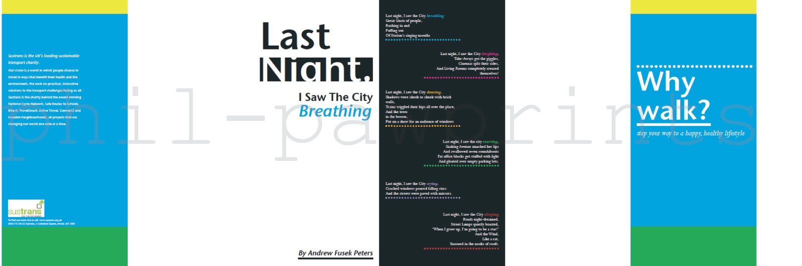
Our final typography project of the year (yeah, already) was to create a leaflet which promotes walking to families, in order to keep them healthy and fit (see here). We were provided with the body copy, and a logo for the commissioning charity, but the rest was up to us.

The leaflet was a clumsy size to work with - imagine two landscape A4's next to one another, and then folded into 6 - creating 12 "sides" which were 210 by 99. Not easy to mock up, not particularly easy to print either. What it did offer though, was a wide scope for spreading the text over the sides quite nicely - there was a chance to experiment with scale, juxtaposition and colour, and I feel I did all these things fairly well.


If you click and zoom, you should be able to read the thing. The colours haven't coped well with the transfer from INDD to PDF to JPG, but you get the gist of what I was trying to do. You'll have to use your imagination as to where the page divdes are, as I didn't export the marks. This is the "inside", because when concertinaed the front and back pages needed to be on the reverse of the printout...


...as seen here. The black and white section in the centre is a poem which was to be present on the leaflet - I wanted this to appear a separate idea to the rest of the information - to make it stand out, but also so as to add variance in the design, lest it become boring.

I feel the type hangs quite well in the leaflet, especially on the first few pages in the inside, and the overall image I feel works. The image of the walking man at the start gives a feel of walking through the leaflet, helped by the colours. I'm quite pleased with it, my only concern would be that the poem looks perhaps too much of a separate entity to the main body, but in its own right I'm happy with the poem too.

I'll admit I wasn't enjoying doing this when I began the sketches, but the piece turned into something I really enjoyed - a culmination of a few skills I've learned this year, and a fairly decent end to this particular type module.