Monday 29 April 2013

Foodbank campaign booklet


A booklet produced to outline a hypothetical campaign strategy for Wolverhampton Foodbank. The cover is above, and some examples of spreads are below:


The physical booklet is 180mm square, and each page appears as a single page, so turning pages with circles on reveal a different graphic in the same space overleaf. The booklet consists of 19 pages.


Thursday 25 April 2013

Shatter Effect

Firstly, apologies. I realise I haven't AT ALL blogged about this brief, despite it being quite a big part of my last six months. Essentially though, these images should explain the brief and my work in full. These are the spreads I put forward for presenting "new and innovative ways of promoting a pre-existent brand". The brand, in this case, was a local band called Shatter Effect. This project was much more about marketing and promotion than it was about design.


It helps to like the client you're designing for - and in this case I don't even have to lie about that! You can check out the band on my recommendation below. They're also at www.facebook.com/ShatterEffectMusic and www.twitter.com/ShatterEffect.


Saturday 13 April 2013

Foodbank posters

I posted a couple of weeks ago about a campaign I was putting together for Wolverhampton Foodbank. Well, I say for them - they know I'm doing it, as to whether it will really be used... It's unlikely! Regardless, the concept is still sound.

I don't want to bore you with the countless pages of ideas I've produced (these will be used later though!), so here's the main outcome: two posters used to highlight the main message of the promotion. 


The campaign hinges on two points. Firstly, it was important to make people aware of how much food they waste, and therefore, how much money they are throwing away. Second, it was highlighted how much that wastage amounts to in terms of the foodbank. The viewer is invited to make the link between the two.

The posters were designed to fit with each other to create a circular graphic, which is a reflection of the branding in general, and reflects the circular value of the new logo.

Saturday 6 April 2013

Re-Threading

I reckon it's always important to be aware of ways in which you can enhance a particular visual brand, and update the look and feel of a logotype. So, when we decided we wanted a range of new logos for sections on the Thread, I used it as an opportunity to refresh the whole look of the "brand".

The current "main" logo used.
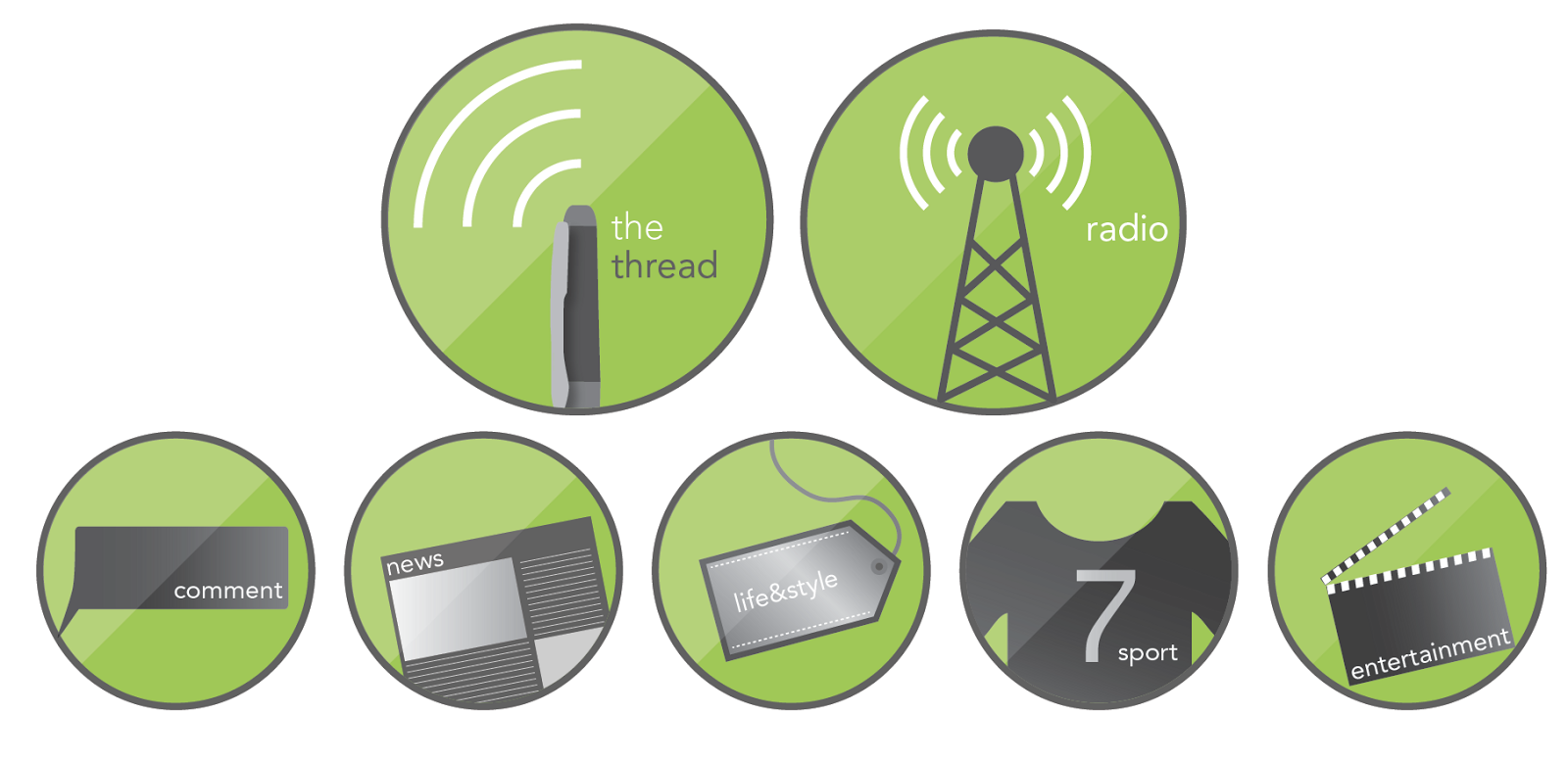
We wanted iconic images to go with each section on the site (they're not actually in use yet, so this is somewhat of a sneak preview... yeah, I know that excites you...), and also to represent the newspaper and radio sections.

This gave the opportunity to slightly change the way we use the logo. The problem we've had with the logo above is its shape - it doesn't lend itself neatly to, say, a Facebook profile picture. This is rectified by adding a second logo.

The new set of logos - with a more rounded look so as to be more flexible, and fit into gaps the above logo can't!

Hopefully, both will be used alongside each other, just to achieve different things. As I say, these aren't in use yet, but will hopefully enhance what is already a fairly strong brand around campus, and make each section more accessible.

Thursday 21 March 2013

Growing a logo

As a part of a year-long project, I've been working on a semi-live brief which involves the promotion of a local charity - namely, the Wolverhampton Foodbank. I've mostly been working on a campaign strategy (which you'll see at a later date), but for now I thought I'd share the new logo I've been working on. First, the old logo:


This logo is a logo used by many foodbanks, and adapted. I felt there were many opportunities missed in the design of the identity here. I wanted to make sure there was a link between the old style, and the new, and so this old logo was a fairly strong influence on my "re-brand"


My interpretation is above. I took some of the same themes to do with nature and growth, but created something rather different. The two sides "food" and "bank" are connected in a smooth and organic way, and the addition of the leaf to this creates an apple graphic. The rest of the text is flowing, and represents the growth/vines present in the old identity.

Thursday 14 March 2013

Sounds like summer?

A wee little brief I managed to squeeze into my busy schedule. An enjoyable one, too. The slide below tells all about it, so I won't waste words by waffling on!